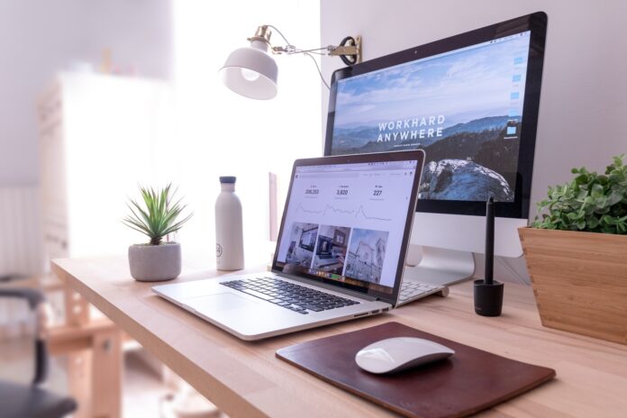
There are several benefits to creating a stand-alone website. You are in complete control of your site, you can customize it to your liking and save your budget. However, creating sites that look professional and can compete with sites that are built by developers or motion graphics agency can be tricky without training. Luckily, if you take the time to learn a few web design best practices, your own website can look great. Even if you don’t have any website building experience, many of these tips are very easy to implement, especially on a platform like WordPress, but if you still need professional help checkout WebSwiggy.
1. Use contrasting colors

The background and color of the font must be sufficiently different from each other so that the text is legible, and the eyes do not get tired of reading it. The most common success is black text on a white background. Avoid combinations of light gray, yellow, and green. Remember, if you have to squint to read the text, then you have done something wrong.
2. Make your content readable
It’s no secret that content is critical to a website. It should be easy to read, which is a web designer’s job. There should be a contrast between the text and the background color. The font size should be large enough to be easy to read. Spaces, line heights, images, videos, bulleted lists, and other formatting help make the content easier to read. Choose “almost black” instead of black. A trick that not everyone knows about. Charcoal black is sharper on our eyes, so they can tire quickly, making it difficult to focus on the letters.
3. Don’t neglect alignment
If you are looking at your site or application, and you feel that something is wrong, first make sure that your content is in visual harmony with each other: the margins are even, there are no large spaces between photos and text, etc. You can notice the difference by looking at the screen of the same site, but with a different design.
So, by just aligning the content, you can make your website or application 10 times better and more pleasing to the eye.
4. Use content presentation settings in search results
If it is important for you in which version the content is presented for a search query within the site or application, make the content in the form of a ranked list. If the order is not so important, it is enough to set the settings in which the content for the search query will be shown in the form of a grid (as on the sites of Pinterest or AliExpress).
5. Make your design user-friendly
You may have never thought about it, but when using an application or website, our hands can strain. Surely you have repeatedly noted to yourself, visiting any web page, that it is extremely inconvenient for you to reach the content in the upper left corner. And it’s not about the size of the phone at all, but about the placement of content. To make your website or app more effective and user-friendly, place key buttons and navigation buttons in the lower third of the screen. Ideally, applications should have a function to switch from the right dominant hand to the left and vice versa.
6. Use color palettes
Fireart considers color manipulation as a kind of dark magic. You can constantly experiment by trying different color combinations with each other. In order not to spend a lot of time on this process and see how certain colors will look next to each other, use special sites. For example, on the Internet portals Dribbble, Coolors and Color Claim, you will find numerous ready-made unique color combinations.
7. Be careful with site architecture

Dividing content and navigation into sections is especially necessary for sites with a lot of content. Users have a positive attitude when the site offers them quality navigation. This means that a good site architecture will help them navigate the web page easily, which will ultimately lead to increased conversions. Want to know how it’s done? Keep a few tips:
- Indicate what next step should be taken by site visitors;
- Ensure consistent navigation and design across your site;
- Guide visitors only with relevant internal links.
8. Make your site mobile friendly
Since a huge number of people visit the site using mobile devices, it is very important to optimize the site for them. Add to all this the growing popularity of voice search, mobile push notifications, SMS marketing, and more. This kind of optimization becomes vital.
If you’re not sure if your site is mobile-optimized, use the Google Mobile Friendly Test. Themes such as Elegant Themes and Thrive Themes offer mobile versions that make it easy to customize the look of your site on mobile devices.
It is highly recommended not only to run various testing tools, but also to perform “manual checks” yourself. This will help ensure that users have a positive mobile experience.
9. Make your ads attractive
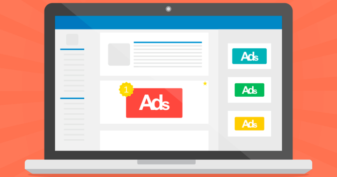
A potential customer’s buying decision directly depends on the list of your products and services. Make a clear set, without noise and crowds. Showcase your products / services to your visitors in a beautiful and professional manner using important information such as product images, descriptions, and prices. Try to keep your product page very clean and informative and not add too many products to your category pages to keep it clear and relevant.
10. Simple navigation
Reliable and understandable navigation with perfectly placed call-to-action plates can increase your sales from visitors. The navigation menu on your company’s website is an essential element that helps visitors view your website on different pages. The user does not want to put in a lot of effort to find something on the website if it is not easy to access. Keep your navigation bars simple and concise, with easy-to-read text for users to navigate. You should also consider placing a search box in your website design to encourage visitors to search for something on your website.


